Thursday 7 November 2013

ORIGINAL WORK- INSPIRED BY VEE SPEERS


ASSIGNMENT 5- ORIGINAL WORK

PHOTOGRAPHS INSPIRED BY VEE SPEERS


FACTUAL: This is a photograph that I have taken myself of my best friend Beth. This is my interpretation of a photograph created by Vee Speers. In Speer’s photo, she uses a girl with slightly longer hair, a completely plain white background and a pair of scissors at the bottom of the plat. However I have made mine slightly different in that she is wearing a different outfit, her hair is shorter, the backdrop has small circles on it, and she is using her hands as a replacement for the scissors.

CONTEXT: This photograph is set in a house, or could be studio, using a white backdrop with small blending circles in it. The color in her hair and clothes show good contrast so that the whole photo isn’t all in white. This photo fits in well with Vee Speer’s ‘The Birthday Party’ and ‘Thirteen’ albums.

TECHNICAL: This photograph taken by a digital SLR camera ‘Nikon D3100’ with an 18-55mm lense. The scenery is a plain white backdrop. The lighting wasn't a very big part of this photograph; however I did use a flash that was pointing towards her hands when I took this.


AESTHETIC: I really love this photograph because I love Vee Speers original, and I love my own interpretation even more. It is one of my favorites of the photographs I took, because it works so well as a picture, and really ties in with the other albums. I especially love how her hands almost look intertwined around the bottom of her plat and her hair is shiny where the light has hit it.

ASSIGNMENT 5- POST 1

VEE SPEERS

  • STYLE: Vee Speers has an extremely unique style. Her work is very different to most peoples. As she has written on her website "I don't like to follow the crowd" she likes to be unique. Her style is disturbing and beautiful both at the same time. Her images tell a story of something that is somewhere between fantasy and reality. Some of her photos are more complex than other like 'Bordello' and 'The Parisians', however 'Thirteen' and 'The birthday party' are very simple and are only taken against some sort of white background. Also 'Thirteen' and 'The birthday party' have been taken in colour, but 'The Parisians' and 'Bordello' have been taken in black and white.
  • TECHNIQUE: Most of Vee Speers collections use very simple backgrouds, but this is very effective. She also uses very interesting costumes and hairstyles to bring her photographs to life. For example in 'The birthday party' Speers used subtle hand-tinted color techniques on top of the original black-and-white Polaroid prints to added effects. I think that in many of her photographs, she has used a digital DSLR camera to really capture the sharpness in each of the photos that she has taken. I also i think that she uses a very high quality piece of editing software like photo shop to make her photographs more supernatural.
  • NARRATIVE: I think that there is a very in depth story behind every single photo taken by Vee Speers. For example in the 'Immortal series' Speers uses models with a saddening background. The photos from this album are the characters from the birthday party grown up. It is showing that the models are almost angels that have fallen from heaven. 

INSPIRING SLIDESHARE


Depth Of Field from maxaha
This slideshare has been very helpful. It is very to the point and is easy to follow. It is very precise and can be used well by anyone, even for beginners.

INSPIRING SLIDESHARE


Photography from Lyn Ross
 Although this slideshare is short and simple it is very good and to the point. I really like this slideshare as it shows you how to take pictures properly and it also teaches you the very basics if you are a photography begginer.

ASSIGNMENT 4- VEE SPEERS


THIRTEEN

During my daughter’s thirteenth year, I photographed her as her childhood was eclipsed by growing pains and a desire for independence. The transition was unexpectedly fast, almost like observing the opening of a flower on fast forward. After capturing the last days of childhood in The Birthday Party, I have visually linked Thirteen by photographing only my daughter as the muse, against the same grey wall. It is, however, clearly a different story – one that explores the transformation from child to young woman, and new found freedom.
By Vee Speers.


FACTUAL: This photograph was taken by the photographer 'Vee Speers'. It is a picture of a girl pushing round her shoulder blades with feathers stuck on them. This picture is from the album named 'Thirteen' and she has used her daughter as a model in this photograph. This photograph is number 1 in 'Vee Speers' portfolio and is un-named.

CONTEXT: This picture fits in with the album 'Thirteen' and fits in also with the album 'The Birthday Party'. The two albums are very similar in that they both have all the photographs taken of them all with a white background. All of the photos use children as well so it fits in with 'The Birthday Party'. This photograph is set in a studio or in front of a plain white wall. Her hair is the only thing in the photograph that is in color, this shows very good contrast. The white skirt ties in well with the theme, and blends in very well.

TECHNICAL: This photo was most likely taken in front of a plain white wall, or in a studio with a plain white backdrop. I think that this photograph would have been taken with a digital SLR camera, much the same as many of Vee Speers' photos. I think that the lighting will be of a large scale, i would imagine that there will be large lights that illuminate the wall behind her and then maybe a smaller light shining on the top of her skirt as you can see, the skirt is possibly the most vibrant part of the photograph. There isn't a set focal point in the photograph, obviously she is the focal point but there is nothing on her that Speers has specifically focused on.

AESTHETICS: This image is one of my favorites, i love the way her back is bear and displays two single feathers, and her skirt is very vibrant which although she is also against a white background, it still provides a very nice contrast between the shade of white on the wall, and the shade of white on her skirt. I also love the way her head is slightly turned to the left.

IMMORTAL

Vee Speers’ photo-based art, Immortal, 
is at once alluring and disquieting with beautiful youths set against backdrops of Eden-like natural beauty, or scenes of post-apocalyptic destruction. These Immortals are real people, young and beautiful, but they seem isolated, exposed and vulnerable, trapped, distant, on guard, defiant, and confronted by echoes of subliminal fears and insecurities.


With the smooth gloss sheen of fashion-model perfection Speers has created a new world that merges Mona Lisa charm and mystery, with the melancholy of Dorian Gray. The surface is loaded with reference both to classical art, and to the airbrushed Photoshop perfection of youthful beauty that has become the everyday obsession of western culture.
These Immortals are all like tragic fallen angels, eyes opened with animal intelligence, looking out onto an uncertain future, not even aware of how perfectly beautiful they appear to be right now.
By Jim Casper


FACTUAL: This photograph was taken by Vee Speers. It is a photo from her album of photos name 'Immortal' This is #1 in the album and is un-named. In this album, the guests of the birthday party have grown up. As Speers tells us "The escape of adolescents into fantasy is just as important as in childhood, only as young adults, the escape is quite often into the virtual world of film, television, and internet. So the imagery i have created, is an isolated world unique to them. Somewhere between fantasy and reality. I want them to be alone, standing like fallen angels, but still part of a common world.

CONTEXT: This picture is very different to the albums 'Thirteen' and 'The birthday party' also created by Vee Speers. This one is set in a place that is outside. It is near rocks and trees and rubble. It looks very cloudy and foggy, it has a very strange background which may well symbolize her life, and maybe even the dark route she took to get there.

TECHNICAL: I think to make this photograph possible, speers has stood this women in front of a green screen and created some trees and rocks and fog behind her. I think that this photo will have been taken using a digital SLR camera. It looks as thought there is some light shining off her skin so there will be some lighting pointing towards her arm and the side of her body. Her eyes and body may possibly have been enhanced on some editing software to make her eyes more vibrant and her skin more pale.

AESTHETIC: I am not sure about this photo. I think that it is creative, but disturbing at the same time. I am still slightly confused with this album because i don't understand the lack of clothing or the background but none the less it is very different. I can't help but feel that this girl is in some sort of pain, maybe emotionally, or maybe physically but that is the message that this photograph gives across to me.

THE BIRTHDAY PARTY

The immediacy of Vee Speers’ imagery is overwhelming. Faces look directly at the viewer creating a quietly dramatic tension urging a reaction from the viewer. Speers earlier work in a series entitled ‘Bordello’ constructed elaborate filmic interiors of fantasy. Her new series, ‘The Birthday Party’ still presents us with a façade of fantasy but with a pared down aesthetic that amplifies the visual intensity through its simplicity. These portraits of children confront us with reminders of our own childhood, whereby a homemade costume can transform you into a superhero, princess, cowboy or soldier, poised for adventures and hours of fun and excitement. The escapes that these worlds of play can provide disclose the underlying realities of the modern world, wrought with conflict and violence. Child psychologists use observation of play to decipher underlying traumas and issues that a child may be experiencing. Looking at these photographs, Speers strikes a chord within us to trigger our own concerns in relation to today’s paranoid society. The emotive responses to her work divulge more about the viewer than the viewed.
By Laura Noble


FACTUAL: This photo was taken my Vee Speers. It is from 'The birthday party' album, and is a picture of her daughter. In this photograph her daughter was 9 and Speers had gotten the inspiration for this photo shoot when her daughter had a fancy dress party. She used her dress from a previous dance show she had performed in. The taking photo's was just because Vee Speers wanted to take some photos of her daughter, but then her thoughts grew and she ended up photographing her daughters friends so that they could form the album 'The birthday party.

CONTEXT: Vee Speers's daughter is standing in front of a white wall. Her pink dress is a very good contrasting color against the pale white background. This photo was most likely taken in Vees house or in a studio. Speer's daughter is facing away from the camera.

TECHNICAL: To make her hair possible, Vee Speers had to hire in a professional hairdresser who stuck a balloon under her hair, and sculpted the hair that was the same color around the balloon. You may wonder how Speers managed to get the picture of the bubble, well it has a chemical in it that doesn't make them pop for about 3 minutes. I think that this photo was taken along side others with a digital SLR camera. There is some lighting shining on her bubble because you can see the reflection and i think that her skin has been enhanced. 

AESTHETIC: I think this is an extremely amazing photo. This is my favorite photo that i have seen! It is very clever the way that she is standing and how she managed to stay still. I really like her velvety pink dress and i really love her big bun in her hair.

PARISIANS

One senses the photographer’s keen eye for detail and symbolism as her subjects perform dramatically for the viewer, or pose against a backdrop, Speers’ dramatic set-ups are reminiscent of the early touring circus shows where peering voyeuristically into another world touched on all the senses. Speers met and photographed all her subjects in Paris.
‘Paris is one of those cities where people can express themselves as they like, and no-one bats an eye-lid. It’s easy to be inspired here.’


FACTUAL: This photo is from the 'Parisians' collection taken by Vee Speers. It is #1 in the collection. This photograph is of a women named Amanda, and was taken in 2005.

CONTEXT: This album of photos are based around the 'Parisians'. The people in this series from what i can see were very quirky, and unconventional. As long as everyone is standing in a different way, and everyone creates a different picture, it will always be very interesting.

TECHNICAL:I think that this photo will have been taken using a digital SLR camera. I think there is a possibility that she might have used a black and white film camera placing her model in front of a black studio wall paper, however i think that as this has been taken recently and with regards to the quality i think the chances of it being a digital SLR camera used are very high. This would allow her to view the image both in color and in black and white so that she can see which one is best, and then she would develop her image further using some editing software such as photo shop.

AESTHETIC: I really like this photograph because of how intricate and precise the tattoos are, that are placed on Amanda's back which is facing the camera. I think that the fish in her hair and the fish tattoo create an under sea theme. I especially like the way that Amanda is the very clear focal point of interest. She is the only thing that is in the photo so there is nothing else to pull away your eye due to the blank background.

BORDELLO


The twighlight of Vee Speers’ great photos of beautiful women causes the viewer to merge with the surroundings of the image and enter a kind of dream-like vision of an often sordid reality. Shapes lose definition and imagination over weighs perception. Real life is left behind… the boundaries between subject and photographer become more and more indistinct. She shows beauty where beauty can be terribly absent. 
By Karl Lagerfeld


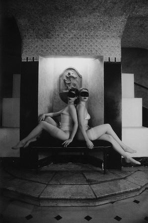
FACTUAL: This photo was taken by Australian photographer Vee Speers. It is from the album 'Bordello' and is number #66. Bordello is very similar to the 'Parisians' in that the colors that are used are the same. They are both black and white.

CONTEXT: This photo is set in a room with a step and a bench where the women are both sitting.There skin is very white compared to the rest of the sections of the photo which adds contrast in color to the picture. It is set in a time that is different to how we are now.

TECHNICAL: I think that much like the 'Parisians' this is a very effective photo. I think that either a black and white film camera or digital SLR camera was used for this photograph. I think that this photo was most likely taken by digital SLR camera, and then edited to make it the colors that it is by using an advanced editing software. 

AESTHETICS: I really like this photo because it is so simple, yet so complicated. I like the way that the women are positioned in the photo however i do think that there is too much excess objects and patterns going on around them because when i look at them my eyes aren't drawn naturally to the women which is obviously supposed to be the focal point of interest.


This is the slideshare i produced on Vee Speers and some of her work.

Sunday 3 November 2013

POST 4:LEARNING HOW TO RESEARCH EFFECTIVELY

DEPTH OF FIELD


DEPTH OF FIELD DEFINITION: Depth of field is the amount of distance between the nearest and farthest objects that appear in acceptably sharp focus in a photograph. A preferred selection of depth of field in an image, can be quite subjective. It varies depending on the type of camera you are using.

FACTUAL: This photograph was taken by a very talented photographer named Vee Speers. This from her album called 'The Birthday Party' and is image number #22. The birthday party is a collection of children's portraits. In this album, Vee Speers has stripped away the stereotypes of children, and has re-created what are supposed to be 'The happiest days of our lives'. These photographs reveal the cruelty, vulnerability, and duplicity of children.

CONTEXT: This fits in with all of Vee Speers work, because it is set in front of a white background and has the child in the photograph displaying his top half of his body and wearing an interesting hat. This fits in well with Vee Speers collections 'Thirteen' and 'Birthday party'.

TECHNICAL: I think that this photograph would have been taken with a digital SLR camera much the same as Vee Speers other work. I think that the lighting was pointed at the top of his helmet as it stands out as the most shiny part of the photo. I think that she may have edited this photo, to make the boys skin look paler than it actually is. This photograph was most likely taken in a studio.

AESTHETICS: I really like this photograph because it is very unusual. It shows very good contrast between the boy's shorts and hat, against the white wall. This is very effective because it shows that he is very skinny and his ribs are sticking out. In this photo you can not see his whole face, this is effective because it makes you wonder what facial expression he has, and i like it very much because it leaves me with a sense of mysteriousness.

I found this presentation from slide share very good, and easy to understand:


POST 3:LEARNING HOW TO RESEARCH EFFECTIVELY

LIGHTING


HAIR SCULPTING: Leighton was known for his long hair styles. This one used Dynel Fiber. (John Hedgecoe)


LIGHTING DEFINITION: The lighting is a fundamental part of photography. Photographers different types of lighting in all of their compositions. Sometimes when taking a photograph, Photographers take advantage of the natural lighting in the photograph, other times, photographers change the lighting in their photos so that they can achieve the point of lighting that they were looking for. The different ways in which the photographer arranged the light on a photo can have a huge impact of the final image, because even using natural light the lighting can be manipulated and maybe even change the whole style or theme of a photo.

RULES OF LIGHTING:
  • Exposure
  • Lighting one subject
  • Lighting groups
  • Lighting backgrounds
  • Putting it to work
FACTUAL: This photo was taken by a photographer named John Hedgecoe. This is an image of 'Hair Sculpting' It was taken by a very talented hair dresser called Leighton. This design of hair used Dynal fibre.

CONTEXT: This photo is set in a studio, or just in front of a plain wall. It is set in a time which could be either day or night this is not shown in this photo because the photo has been taken in black and white to really show off the hair style. As this is the main focus of this photo.

TECHNICAL: In this photograph, the lighting is directed at the woman's right shoulder. Although the main point on interest in the photo is her hair, because it is to promote Leighton's 'Hair Sculpting' creations. Although the lighting is based upon her right shoulder, it does not pull focus away from the woman's hair. 

AESTHETICS: This is a good photo. I like the way the woman is positioned in the shot, and i like the way the lighting strikes her shoulder. In this photo her shoulder provides another point on interest rather than just the focal point being placed upon her hair. I like the way that this photo has been produced in black and white because it shows simplicity and really brings out the main objective of the photo.

EXAMPLE:

butterfly lighting by Darlene Hildebrandt-1.pngBUTTERFLY LIGHTING: Butterfly lighting is aptly named for the butterfly shaped shadow it creates under the nose, by placing the main light source above and directly behind the camera. The photographer is effectively shooting underneath the light source for this pattern. It is used most commonly with glamour models and to create shadows under cheeks and chins.


Rembrandt lighting by Darlene Hildebrandt.pngREMBRANDT LIGHTING: Rembrandt lighting is named after the painter Rembrandt. This is because he often used this pattern of lighting in his paintings. Rembrandt lighting is identified by the triangle of light on the cheek. To create a proper picture using Rembrandt lighting, you have to make sure the eye on the shadow side of the face has light in it, and has a catch light.


Links of websites that i found using whilst creating this post:

http://www.popphoto.com/gallery/top-10-photography-lighting-facts-you-should-know
http://www.pinkbike.com/news/basic-light-tutorial-2011.html
http://www.digitalcameraworld.com/2013/04/15/photography-lighting-take-control-of-natural-light-to-using-flash/
http://pixelogist.me/2012/12/01/understanding-light/
http://www.all-things-photography.com/types-of-photography-lighting.html

My slideshare wasn't working properly so i have a link to the presentation i made on google docs:
https://docs.google.com/presentation/d/1SgDb2kn4Fjt5ICHjO1cqp8DOqXOEhFOwm2-TdEhg5oQ/edit#slide=id.p


Tuesday 22 October 2013

POST 2:LEARNING HOW TO RESEARCH EFFECTIVELY

FOCAL POINT


DEFINITION: A focal point is the place that the human eye is naturally drawn too when they look at a photograph or the central point of interest. Focal point is something that you must consider every single time you take a photo because you will always need a point of interest in a photo. In this photo, Cinderella is running down the stairs, she is the point of interest, and her face is the thing that is most focused. Because of the colour difference, her face, neck, and arms stand out from the rest of her because her dress is blue. In this photo the first thing that i notice is her face and neck.


FOCAL POINT RULES:
  • Focal Position
  • Motion
  • Breaking The Rules
  • Leading The Eye
  • Negative Space
  • Explore Issues

FACTUAL: This is a photograph of  Disney's 'Cinderella' and was taken in 2007. This photograph was, along with many other Disney characters, taken by Annie Liebovitz. The title of this photograph is 'where every Cinderella story comes true' and Annie used Scarlett Johansson as a model. This is another photo from the 'Disney Dream Portraits' collection all done by Annie Liebovitz.

CONTEXT: This photo is set on a stair way in front of the castle where Cinderella dashes away from when she has to make a quick exist at midnight, and in her haste, she leaves behind her glass slipper which is in this shot, at the top of the stairs. It is set at night time because we know from the story that Cinderellas' fairy god mother granted Cinderellas' wish to go to the ball, but the only condition was that she was to be home by twelve o'clock because the spell will then begin to wear off.

TECHNICAL: In this photo the lighting is all shining towards the castle, despite this Cinderella is still the focal point of interest. The main thing in this photo is Cinderella, but Annie has used the castle to show that she is a princess, and used the stairs leading up to it, and the plants/ bushes and the dark sky to ensure that the background is kept busy, and everywhere you look in the photo there is something going on.


AESTHETICS: This is one of my favorite photographs taken by Annie Liebovitz, i really the way the castle has been illuminated, but Cinderella is still the focus in this photo. I love how this photo tells the story of Cinderella, and the glass slipper that she left behind at the ball is included, at the top of the stairs and has a beam of light shining onto it.The castle and other various things in the background are good because they provide alternative points of interest in the photo.

EXAMPLE:

NEGATIVE SPACE: Negative space is the space that surrounds the main subject in an image. Mostly when taking photos, we focus ourselves more on the main subject of the image, and don't take as much care and put as much thought into the space surrounding it. The extra space around the picture will either make your picture amazing, or make it inadequate. Negative space can strengthen the composition in your piece. Negative space can also bring balance to your photograph. It also helps to make your main subject more eye catching.

The Log Bridge - Varina PatelLEADING LINES: Leading lines might be the most obvious way to lead the eye- and they are not to be ignored. Leading lines are very good to help point the viewer in the right direction (to the main point of interest). Although this isn't the only way to make your focal point more attractive and noticeable.In this picture, there is a log bridge that enables your eye to follow it all the way to the end. Although there isn't really a focal point at the end of this, it is more at the beginning of the bridge that the focus is on, but your eye still follows down to the end.

Links for websites that i found useful in the process of making this post:
http://www.digitalcameraworld.com/2013/07/25/using-focal-points-in-photography-how-to-get-perfect-composition-every-time-you-shoot/
http://digital-photography-school.com/using-focal-points-in-photography
http://www.dummies.com/how-to/content/create-a-focal-point-in-your-digital-photograph.html
http://www.picturecorrect.com/tips/focal-point-in-photo-compositions/

I had some trouble with slideshare, and could not add my presentation on focal point onto slideshare. So this is the link to the presentation i made using Google Docs:
https://docs.google.com/presentation/d/1X0Z8ifLNdJYxGgVx4ITIoJiwMp2AO_rSOowQOww7PsM/edit#slide=id.g11ccbb952_0112


Monday 7 October 2013

POST 1: LEARNING HOW TO RESEARCH EFFECTIVELY

COMPOSITION

COMPOSITION DEFINITION: Composition is the way in which you place or arrange the person or thing in your photograph. In this photograph, when considering the rule of thirds, Disney's Ursula is placed along one whole line, and it is a considerable amount of space away from the center, this provides an additional point of interest.

PHOTO COMPOSITION RULES:
  • Rule of thirds
  • Balancing elements
  • Leading lines
  • Viewpoint
  • Background
  • Depth
  • Framing
  • Cropping
  • Experimentation

FACTUAL:
 This is a photograph of 'Ursula' from the Disney film 'The Little Mermaid'. Over the last couple of years, Annie Liebovitz has partnered with Disney to create stunningly colorful pictures, using celebrities posing as Disney characters from classic animated Disney films. Through her partnership with Disney Annie has worked with many celebrities such as: Jenifer Hudson, Taylor Swift, Jack Black, Will Ferrell, Jason Segel, Russel Brand, Johnny Depp and many others.


CONTEXT: This photo was taken by Annie Liebovitz when she was hired by Walt Disney in 2007 to take a series of photographs. It is set in a studio, but the final picture was turned into a sort of cartoon, and was set in the rough sea.


TECHNICAL: The most complicated form of technicality is the lighting. For this shot they used many

different lights and props to make this shot possible. To the cameras right,there is a large octobank shooting through the large diffusion panel towards the queen. There are two large strip banks on either side of the camera, low, illuminating the underside of the tentacles. There are two large octobanks, one above an slightly behind the queen to the cameras left, and the other handheld by an assistant at 45 degree angle to the queen also to the cameras left. Another large octobank is boomed over head, an umbrella illuminates the background, and a reflector held by an assistant to the camera right. 


AESTHETICS: I really like this photo because it is all different shades of blue, except Ursula's arms, face and hair. This is good because it makes us focus on her whilst we are looking at the picture. The fierce sea keeps the background busy and provides an alternative point of interest. The dark mountains make the picture more mysterious. The clouds in the sky fill up the rest of the picture taking us away from Ursula and her tentacles, the splashing sea, and the shadowy mountains.


EXAMPLE:

RULE OF THIRDS: The basic principle behind the rule of thirds is to break the photograph down into thirds, both horizontally and vertically so that you have 9 sections. The theory is that if you place your point of interest in the intersections or along the lines that your photo becomes more balanced, and will enable the viewer to interact more with the photograph.


FRAMING: Framing in photography is very self explanatory, It is the same as you would put a photograph in a photo frame. The idea of framing is used so that you frame an image that you want to be the point of interest. Framing can make an image more aesthetically pleasing, and keep the viewers focus on the framed item.
This is the presentation i produced on 'Composition'

In the making of this post, i have found the following websites very helpful:

Monday 23 September 2013

FIRST ANALYSIS

Angelina Jolie in the bath.

Annie Leibovitz

FACTUAL: Annie Liebovitz was born in Waterbury, Connecticut in 1949. She was the third of 6 children, and had to move frequently with her family due to her fathers duty assignments. She took her first pictures whilst her dad was stationed in the Philippines during the Vietnam war. When Annie returned to the US in 1970, her career started. As a staff photographer, working for the just launched Rolling Stones magazine in 1973. She worked there for 10 years and left in 1983.

CONTEXT: Annie Liebovitz style of photography started when she took photographs for the "Rolling Stone" magazine. This has had an impact on how editorial photographers shoot entertainment celebrities.  In the 1980's Annie developed a new style of of lighting, and use of bold colours and poses, this gained her a spot in the 'Vanity Fair' magazine. She photographed celebrities for an international advertising campaign for American Express charge cards.

TECHNICAL: The bath is an unusual setting for a photograph. Annie Liebovitz is clearly showing off Angelina Jolies' beauty and ability to take risk, there are many aspects of this picture, that are powerful including: The colour of the water, Angelina Jolie and the water are all of the same scale, conveying and eery mood. The picture is extremely powerful because of these factors and because of the strong eye contact she is making with the camera. Annie Liebovitz used a good sense of line in this photograph because of the outline of the bath. The detail of the tattoos on her back and her hair are the only black images, making them the focal point.

AESTHETIC: I really like this photo because of her use of line. I like how she is almost framed by the edge of the bath. The colours in this photo are very musky which is very interesting. I love the detail in her tattoos and the way she is positioned, with everything but her back covered up. This is a mysterious style of photograph. It has a mystical sense towards it. I like this photo because it is very well contrasted.

ME

My name is Mollie Barnard, I am 14 years of age and living in Norwich with Dad, and sisters.
I have created this blog for my GCSE Photography course at Sprowston Community High School.
I have never before used a blog, and i have a personal Instagram, and Tumblr that i use to post photographs that i have taken and re-post images or quotes that i like.